Nate
Vogels

Product and design leader with 12 years across fintech, consumer software, and startups. I don't just define the product — I design it, ship it, and measure it. Currently Director of UX Design at Western Union, driving product outcomes at enterprise scale.

Full-Stack Builder

Think
Design
Build
Ship

I've never been "just a designer" or "just a PM." I started in wealth management at Morgan Stanley, pivoted into software operations at Finfolio, then moved through progressive product and design roles at a YC-backed startup, a consumer app I co-founded, and two enterprise product organizations. The title has changed. The work hasn't — it's always been about creating, shipping, and improving digital products.

I moved into UX design strategically. Design is an effective way to tell visual stories that align teams, surface user needs quantitatively, and turn ambiguous strategy into shipped software. At Western Union, I built a design team from scratch, architected a design system, and shipped production React and Angular code using AI tooling. My team doesn't just deliver Figma files. They ship.

"UX should function as product managers with hard skills — embedding in the product lifecycle from early discovery through post-launch measurement."
12
Years of experience
7
Person team built from 1
20
Products in WU portfolio
500K+
Global store locations
Director of UX Design, Western Union
Ship production-ready React and Angular code via AI tooling — Builder.io, GitHub Copilot, Figma Make, Replit
Architected new Design System — React & Angular
Previously Series 6 & 7 licensed · BBA Finance, CU Boulder
Google UX Design Certificate · GA Product Management Certificate
Product School Founding 200 Member (2020–2023)

Fintech Domain

Global remittance (Western Union, 200+ countries)
Sports wagering (Tipico Sportsbook)
Card-issuing & employee benefits (Zestful / Stripe)
Wealth management & portfolio software (MS, Finfolio)

Career Timeline

12 years building software products across fintech, consumer apps, and enterprise scale.

Director, UX Design
Western Union · Denver, CO (Hybrid) ↑ Promoted Mar 2026
Nov 2023 – Present
Built Retail UX function from the ground up: 1 designer → 7-person team (1 manager + 5 Sr. Designers) in under 3 years, with full OKRs, documented ways of working, and PDLC integration
Expanded product portfolio from 4 → 20 front-end software products through velocity gains, design system leverage, and strong internal reputation
Rescued a stalled high-priority roadmap initiative using AI-accelerated development — shipped production code via Builder.io, GitHub Copilot, and engineering collaboration
Architected "Silk" Design System — Angular-based component library published in Storybook, consumed across entire product suite
Designed Quick Resend: 83% feature adoption, 42 seconds saved per transaction, deployed Globally; transactions under 3 minutes up from 45% → 62%
Reports directly to SVP of Product; work alongside 8 Directors, PMs/POs, legal, compliance, and operations
AI-Accelerated Delivery · Design Systems · Org Building · Enterprise UX
Sportsbook Product & UX Manager
Tipico North America · Denver, CO (Hybrid)
Dec 2021 – Dec 2023
Led UX design and front-end product management simultaneously — a true hybrid role on a US sportsbook launch
Drove app industry ranking from 12th → 4th (Eilers & Krejcik gaming industry report)
Redesigned core bet-placement flow: session-to-bet conversion 17.8% → 25.1% (+41%), median bet time 3.4 min → 2.3 min (−32%)
Owned OKR-based product roadmap; led A/B testing via GrowthBook and behavioral analytics in Mixpanel
Hybrid PM + Design · A/B Testing · Mixpanel · GrowthBook · OKRs
Co-Founder, PM & Designer
Rally Tennis
Jun 2021 – Dec 2021
Co-founded a consumer tennis matchmaking app; solely responsible for product design, roadmap, data analysis, customer support, and research
Launched in 2 months; reached 10,000+ users and 1,000 DAU within 3 months of launch with 5,400+ matches recorded
Iterated on core product based on user feedback: universal filters, automatic availability scheduling, gender preference matching, in-app safety features
Strong engagement metrics; wound down due to monetization challenges, not product quality
0→1 Product · Consumer App · Sole IC · Rapid Launch
Product Manager & Designer
Zestful (YC W17) · Denver, CO · Employee #4
Jan 2019 – Jun 2021
Employee #4 at a YC-backed employee perks platform ($5M seed) powered by Stripe card-issuing
Drove +22% month-over-month user growth and +43% revenue increase through strategic product and design decisions
Designed and launched mobile app MVP in 2 months — ~60% of users downloaded in month 1; reduced card decline rate from ~30% → ~18%
Responsible for product vision, design execution, operations, and sales in addition to PM duties
YC Startup · Stripe · Card Issuing · Mobile MVP · 0→1
Head of Operations
Finfolio · Denver, CO
Jul 2016 – Jan 2019
Portfolio management software for financial advisors — cloud-based platform for account aggregation, reporting, and trade execution
Progressed from Investment Software Specialist to Head of Operations; built foundational SQL, PM fundamentals, and engineering collaboration skills
Led operations team through cloud application launch
Portfolio Management SaaS · Fintech · Ops Leadership
Financial Advisor
Morgan Stanley · Boulder, CO
Mar 2013 – Jul 2016
Junior member of a wealth management team with $350M+ in managed assets; achieved Series 6 and Series 7 licenses
Left to pursue software and product work after realizing my passion was building, not selling
Series 6 & 7 · $350M AUM · Fintech Foundation

Case Studies

Five projects that show how I approach problems — from discovery to outcome.

Tipico North America

Sportsbook App Overhaul

A mobile sportsbook ranked 12th in the industry with UX worse than competitors — diagnosed through industry research, behavioral data, and customer surveys.

#4 Industry ranking
+41% Bet conversion
−32% Time-to-bet
User Research A/B Testing Mixpanel GrowthBook OKR-Driven

The Problem

When I joined Tipico, the app was ranked 12th overall by Eilers & Krejcik (a gaming industry publication that independently rates and ranks sportsbook apps quarterly). More telling: 17th in UX, 22nd in features. A customer survey made it concrete — 52% of customers said our interface and UX was worse than competitors.

The core symptom: it was genuinely hard to place a bet. You'd navigate to a sport, select a game, pick your outcome — and then get routed to a separate betslip page, losing your place in the app. Building a parlay meant bouncing back and forth repeatedly.

The Approach

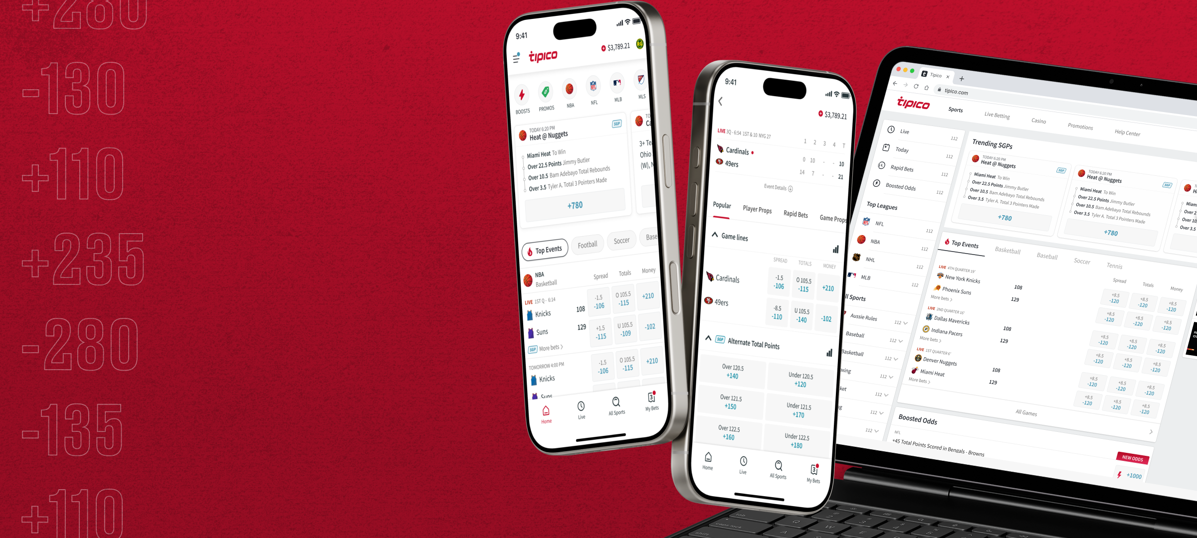
I led an OKR-based product roadmap rooted in Mixpanel behavioral data. We tracked session start, page navigation, outcome selection, and bet placement events to calculate conversion rate and time-to-bet. This gave us precise baselines and a feedback loop for every change we shipped.

The biggest unlock: converting the betslip from a standalone page into a persistent drawer accessible from anywhere in the app. We launched an MVP through GrowthBook A/B testing to validate direction before full rollout. Even the MVP moved conversion from 17.8% to 21.6% and dropped straight-bet time from 2.9 to 2.5 minutes.

The full rollout paired the new betslip architecture with comprehensive UI updates across home, navigation, events, league pages, and my bets — plus a full refresh of the brand visual language ahead of the Ohio market launch.

Tipico app redesign — mobile screens

Outcomes

#4
Industry ranking (from #12)
+41%
Bet conversion (17.8% → 25.1%)
−32%
Time-to-bet (3.4 → 2.3 min)
−38%
Straight bet time (2.9 → 1.8 min)
Western Union

Quick Resend

67% of WU transactions are repeats from the same customer to the same receiver — but repeat transaction time (3 min 9 sec) was barely faster than starting fresh (3 min 45 sec).

83% Feature adoption
42s Saved per transaction
200+ Countries deployed
Field Research Data Analytics Rapid Prototyping Quantum Metric Enterprise UX

The Discovery

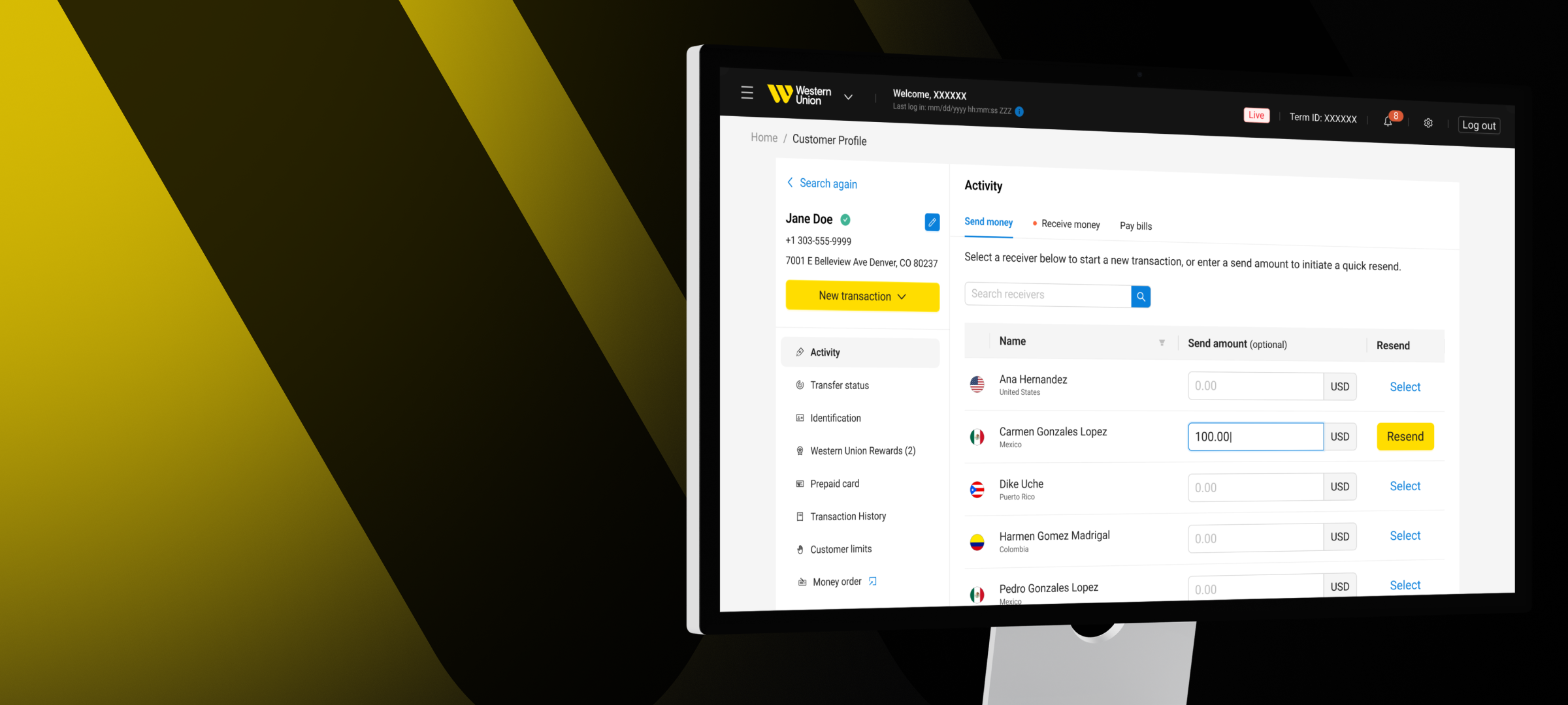
My team conducts regular in-person field visits — sitting alongside Western Union agents in physical store locations and walking through their experience. What we found: 67% of all money transfer transactions are repeat transactions from the same customer to the same receiver. Yet repeat transaction time (3 min 9 sec) was barely faster than starting a new transaction (3 min 45 sec).

Agent commentary was direct: "Customers ask what delivery service they used last time and can't remember." "Most of our customers have sent before, but WUPOS doesn't save the info so we enter it every time." "I wish there was a way to copy what worked last time."

The Design Challenge

Western Union's transaction platform has hundreds of compliance and legal triggers — country restrictions, send/receive amount thresholds per corridor, requirements based on payment and pickup method. Surfacing a "repeat this" feature meant navigating a significant API and architecture challenge, not just a UI change.

We ran two design explorations before landing on the final solution: a streamlined customer lookup embedded directly in the Send Money flow, with a receiver selection list that pre-populates transaction fields. Two iterations resolved performance and API sequencing issues that early explorations surfaced.

Western Union Quick Resend — final UI

Outcomes

83%
Repeat transactions using Quick Resend
42s
Average time saved per transaction
40
Countries where feature is live
+17pt
Transactions under 3 min (45% → 62%)
Zestful (YC W17)

Mobile App MVP

~30% of Zestful card transactions were declining — and ~50% of those declines were due to insufficient funds, because users had no way to check their balance on the go.

60% App download rate, month 1
~18% Decline rate (from ~30%)
Mobile MVP Data Analytics User Research Stripe Integration Rapid Launch

The Problem

Zestful is an employee perks platform powered by Stripe card-issuing — companies give employees a perk card loaded with funds for specific categories (food, wellness, learning, etc.). The problem: ~30% of card transaction attempts declined. Of those, ~50% were due to insufficient funds — customers didn't know their balance.

We triangulated this through support data in Intercom (many tickets were customers asking "why did my card decline?"), declined transaction analysis by reason code in Stripe, and customer surveys that surfaced the core insight: people were "out and about" with no way to check their balance or their category restrictions.

The Solution: Focused MVP

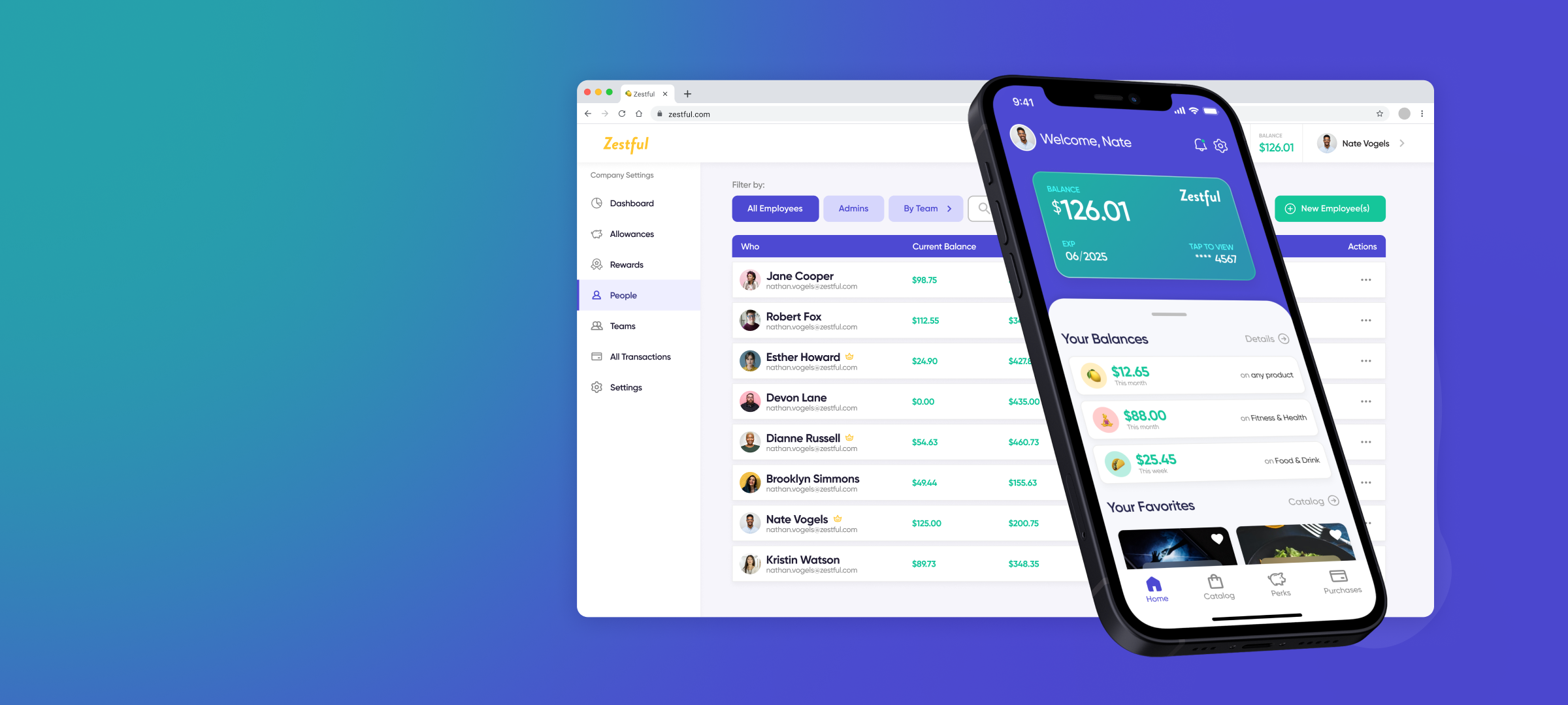
Rather than building a full mobile application, we identified the minimum that would solve the core pain: a balance check screen showing category breakdowns, and push notifications for decline events. Three user stories drove the entire MVP: check balance before a purchase, understand what the card covers, and get notified when a decline happens so you can troubleshoot immediately.

This focus let us ship in 2 months. The lean scope was a deliberate product decision — we validated the hypothesis before investing in a full mobile experience.

Zestful mobile app — balance and perks screens

Outcomes

60%
Users downloaded app in month 1
~18%
Decline rate (down from ~30%)
~33%
Insufficient funds rate (from ~50%)
2 mo
Ideation to launch
Rally Tennis

Tennis Matchmaking App

Finding a tennis match required Facebook posts, email threads, and private leagues that don't match skill levels — a completely unsolved problem for the 20M+ recreational players in the US.

10K+ Users in 3 months
1K Daily active users
5,400+ Matches recorded
Co-Founded Consumer App 0→1 Build Sole PM + Designer Rapid Iteration

The Problem

Tennis players who want to find a match face a genuinely fragmented problem: private leagues are expensive and poorly organized, Facebook groups have low success rates, and existing apps have inactive user bases. None of them show availability, match skill levels accurately, or enable in-app coordination without exchanging personal contact info.

What I Built

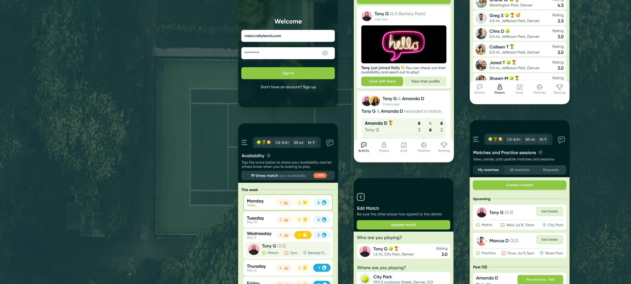
As co-founder and the sole PM + designer, I was responsible for the entire product: roadmap strategy, design, research, data analytics, and customer support. We launched the app in 2 months with five core features: an activity feed, a player discovery list with skill-based filtering, availability matching, in-app messaging, and match recording with a leaderboard.

Post-launch iteration was rapid. The filter experience was redesigned to apply universally across the app (not just player search). Availability was automated with "typical availability" that pre-populated each week. A gender preference setting was added after women reported receiving unwanted requests. In-app safety tools (report, block, delete) were shipped after early feedback.

Rally Tennis — chat and availability screens

Outcomes & Takeaways

10,000+ users, 1,000+ DAU, and 5,400+ matches recorded in the first 3 months — with strong engagement metrics. We wound down due to monetization challenges, not product quality. The app found real product-market fit on engagement, and the user feedback loop shaped meaningful feature improvements within the launch window.

10K+
Signups in 3 months
1,000
Daily active users
5,400+
Matches recorded
2 mo
Concept to live app
Half Baked Harvest

Recipe App — Design Concept

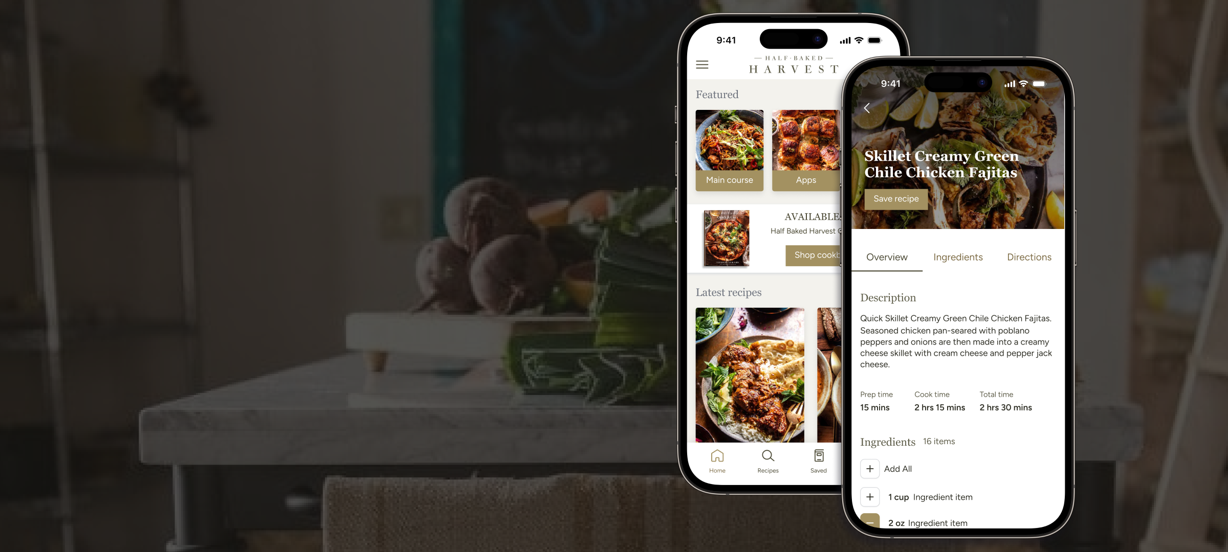
Recipe apps are cluttered, ad-heavy, and built for content discovery rather than actual cooking. This concept reimagines the Half Baked Harvest brand as a focused mobile experience: browse, save, plan, and cook without distraction.

Personal Project Mobile Design UX Research Figma

The Problem

As a cooking hobbyist, I've always found recipe apps frustrating — not for lack of content, but because they're designed to maximize ad impressions, not to help you actually cook. Allrecipes is cluttered, Tasty is video-first in ways that don't help when your hands are covered in flour, and Yummly's personalization adds interface complexity without enough payoff.

Half Baked Harvest has some of the best recipe content on the internet, with a strong visual brand and loyal following. The concept: what if that content lived in a mobile app designed around the cooking moment — not the browsing moment?

Research & Personas

I defined two primary personas: Jessica (28, tech professional, beginner cook who needs step-by-step visual guidance and grocery planning) and Andre (35, software developer and father of two who needs quick, family-friendly recipes without the clutter). Their pain points converged: interfaces that get in the way, no good way to plan meals from discovered recipes, and a lack of clear visual guidance during the actual cooking step.

Design Approach

The core information architecture was scoped tightly: Home (featured + personalized + trending), Recipe Detail (overview, ingredients, step-by-step with visuals), Search (advanced filters, cuisine categories), a Recipes collection (saved + planned), Shopping List (consolidated, checkable), and Profile. Every feature justified against one of the two persona use cases.

Visual design pulls directly from the Half Baked Harvest brand — warm tones, clean typography, generous use of food photography. The recipe detail screen is the centerpiece: tabbed between Overview, Ingredients, and Directions, with one-tap add-to-shopping-list and similar recipe suggestions below.

Half Baked Harvest app — home screen Half Baked Harvest app — recipe detail screen

What I Bring

Deep expertise across the full product stack — from strategy to code.

Product Management
Product Strategy Roadmapping OKRs & KPIs User Research A/B Testing
AI & Development
GitHub Copilot Builder.io Figma Make Replit Claude
Design
Figma Design Systems Interaction Design Prototyping Usability Testing
Analytics
Mixpanel SQL / MySQL GrowthBook Quantum Metric Amplitude
Leadership
Team Building Cross-functional Influence Executive Comms Hiring & Mentorship PDLC Integration
Domain Expertise
Global Remittance Consumer Apps Card Issuing Wealth Management Enterprise B2B

Let's Talk

If you're building something ambitious and want a leader who can think, design, build, and ship — I'd love to connect.